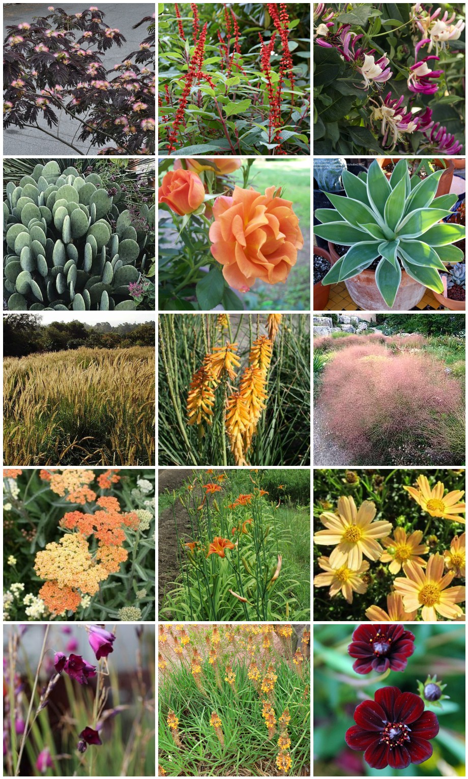
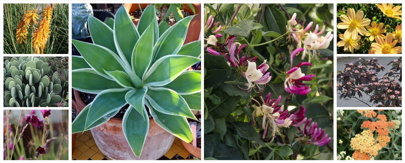
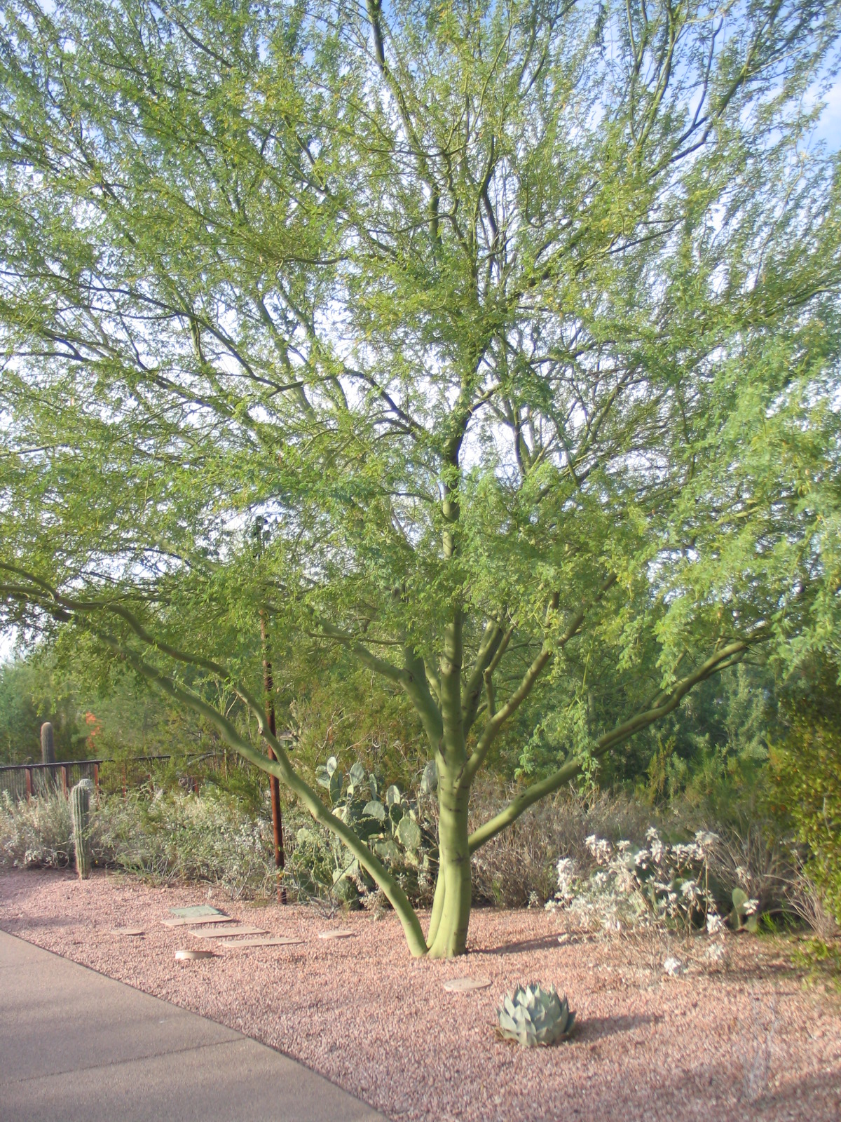
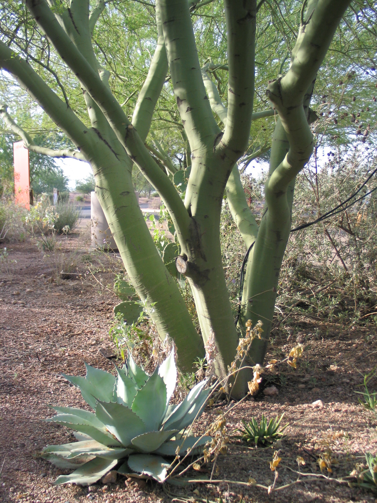
Back here, I talked about the conceptual design process, where I developed and sent over design concepts with a memo full of notes to the Owners. I sent all this via email because they live in Southern California and I live in Northern California, about a 6 hour drive away, so in-person meetings aren't always feasible. I also know the Owners pretty well - the husband is an Architect I have worked with, and the wife has a background in Interior Design - so I trusted that they'd be able to read the memo alongside the concepts and make an informed selection of their favorite. They did exactly that, sending me back comments on their preferred designs and I will now start to draft the designs for use in preparing construction drawings (so hang tight...)The next thing to do is develop the Schematic Design. In Schematic Design, I will make sure that the Conceptual Design evolves to have elements represented at actual size while I strive to hold true to the concept and incorporate their comments. For example, I will make sure that any paths are an appropriate width, furnishings are represented at their real measurements, gates, paving patterns, fencing, materials, etc will begin to be discussed, but I won't change the overall intent. I'll try to remember to share that when it is accomplished.... for now, one of the elements that needs discussion is a planting palette. In every phase of design, I imagine the feel of the place, and few things have more impact on that than the plants!What I'm trying to get at here is that in addition to designing for plants that will thrive in the same sun exposure, watering practices, soil type, climate zone, etc there's an importance to gathering plants that want to be seen together. The plants bring more than just leaves and color, they bring personality (and seasonality!) to the place. The plants and the concepts (at least for me, others may work differently) are not separate discussions, but both part of a larger vision. For this project, I made a huge list of plants I thought would work in San Gabriel as well as plants I thought the Owners would like. I imagined the designs as real spaces, re-imagining them repeatedly with different planting palettes until I had edited the lists down into a concept for the planting palette.Now, this does not represent the layout of the planting palette, and any plant geek can see that I've got some hydrozoning to do (putting low water use plants together and irrigating separately from higher water needing plants). That will happen in future phases, but for now, I am playing with a planting palette as a preliminary concept. For the rear garden, I chose lots of green foliage plants with what I equated to a "Hollywood / tropical" palette with many plants that could also grow in Texas (the Owners are from Texas, which is where I know them from). I did the same exercise for the front, but without the Hollywood / tropical aspect to it. Don't ask me why, that's just the direction it went.The front garden and the rear garden for this project are imagined with different vibes, but that doesn't mean that we can't use some of the same plants in both and we should! Having the two be completely distinct runs the risk of making their property seem disjointed. Take a look at the preliminary palette for the front garden (above) in contrast with the preliminary palette for the rear (below):They seem very different at first, but both have the same Honeysuckle vine in common and the same Agave. Each of the little square photos shows each plant at the same size, and of course we also aren't demonstrating how much of each plant there will be, nor giving a complete idea of their forms.... their impact in real life based only on visual impact could look much more like this for the front:and like this for the rear:See how they relate but take the same impact plants in different design directions? isn't that trippy?! I'll repeat this exercise with materials and furnishings, and the hope is that the whole mess will come together and become more than the sum of its parts.Years ago, when I worked on a pro-bono project with this Owner and had a conversation where he explained to me that the building he had designed had to be white. It wouldn't be the same building if it was not white (I was vehemently against it being white, I thought it was unsympathetic to the landscape). We had what must have been an amusing and fervent "discussion" for any flies on any nearby walls, and in the end, he convinced me. The color was not just a tacked-on thing at the end, it was integral to the spirit of his design. What I'm describing here is that lesson brought forward in my career and applied to my own work. In designing the outdoor environment and making connections to indoor spaces and people, one shrub does not always do the same job as another, and plants are not so interchangeable as one might hope. So stay tuned for the results - between me and the Owners, their home, and the process of refining the design, the end result is always a little bit of a surprise. I will be excited to see how the process progresses with them, and then to see it installed?! holy heck, I can't wait.
Design beginning with a PEN?!
My folks visited me about six months ago or so. While reading my draft portfolio booklet, dad started laughing. He'd read where I stated that I start every design with a pen. 'No you don't, you have a drawing tablet! You draw in the computer!' says my dad. No, I don't, but I thought it was a funny assumption and so here we are talking about it.Here's the thing - using technology is lovely when you know what you want it to do, but when you have no idea, when you're imagining stuff, using Photoshop with a tablet and stylus is not the most direct route from the brain. You have to push buttons, set layers, import files, etc. Forget THAT! For me, using a pen is the shortest distance between creative thought and seeing it with your eyes (on the page).Take for example a current design project in Southern California, it is for the residence of an Architect I worked with years ago:I typically sit in a coffee shop and doodle for a while while studying site photos to really wrap my head around the issues of the site and try out various ways of shaping the space, fitting in uses, etc. I use a printed base plan under tracing paper, my favorite Japanese ballpoint pens, and a latte (in reverse order). The first round is not to scale, exploring idea after idea, small about the size of an index card.Sometimes I do studies that try to fit certain ideas to the site regardless of anything, and these usually look pretty nuts, especially when I don't re-draw the parts I've decided against:After generating several concepts, I refine a few ideas into what I still call conceptual design, and I limit myself to 3-4 per area max. In this case, there's a front garden and a rear garden. Even now, nothing is really measured, it is all eyeballed and still very sketchy. Notes around the edges help me remember the images I had in my mind's eye for plants and other materials. I have to make some assumptions about the clients' lifestyle, and sometimes I suggest things they have not thought of - like what if they said they want the rear garden to be for kids' play but the front is actually a better size for it....(like in this garden).... the interview process can provide a lot of information, but you really can't explore all the possibilities in an interview or two, and it helps to see ideas drawn when discussing them.At this point, I sometimes send it to the client for input. Below are the finalists for the front garden:and here (below) are the finalists for the rear garden:Some clients enjoy working at this sketchy loose level, and this client is definitely one of them. I'm honored to be designing the home landscape for his family, I hold his abilities in the architecture world in high regard and I know he and his wife have great taste. However, there are clients for whom it is more appropriate to narrow things down to one or two ideas and do a much more formal, complete presentation. I like both approaches, but for sure, this one allows for the client to have much more input at the very early stages.SO - which will they choose? We'll see.
Seasonal Planting Overload
A new client's project calls for seasonal plantings in two important pots sitting atop columns flanking the front walkway. I hope to be able to show you the changes we make to the planting palette in the rest of the garden, not sure when, but tonight I have seasonal plantings on the brain.I don't get asked for seasonal plantings very often, so I dove into all the bazillions of options - so many plants, so many cultivars of each! Do you know how many Violas there are? Heucheras? Ipomoea, Coleus, Petunia, and so forth!!? I wound up with 60 photos in short order and had to figure out how to organize it so the Owner (or I) wouldn't have a stroke from too many options. Below are 36 of the 60 I saved right off the bat, you can see how the editing process becomes king. Some are my own photos, some from various growers, many came from Proven Winners (credit where it is due!) which is a large commercial grower that supplies pretty much every nursery I know:There are many constraints in narrowing this down: changes pending in the rest of the garden, soil volume in the planters, and the intention of swapping the plants out seasonally. Additionally, whatever we plant has to look good when it is new, add color coordinated with a TBD planting palette, and be showier than the succulents they have now which blend-in too much with their surroundings. The most limiting of these is the soil volume - not much soil volume = not big plants and not very many. I know, we've all seen photos of amazing stuff in teensy pots, but this is usually the result of growers' careful (read: fertilized like crazy under perfect greenhouse conditions) management and not what we might expect at home.I assume you're familiar with the "recipe" for container plantings? Some say you need "spillers", "fillers", and "thrillers". That's great if you have room for all that diversity and you want mixed plantings. I am not so sure these planters will look so good with too many different things; the soil is only 13" across and 9" deep. They're beautiful planters, just not very big.I came up with a strategy - after I saved all those photos. My strategy with most planting palettes is to gather in lists and photos everything I think will work and then edit until only a few favorites remain. I often print photos of everything and arrange them all over my desk, developing groupings of favorites and rejects, moving photos between these groups often until I've covered all the bases - seasonal interest, form, leaf color and texture, etc. Further edits seek to eliminate anything that clutters the vision, and viola! ... until I show it to my Client ...So tonight, to stave-off the aforementioned stroke, I limited the plants to 3 options: two plant combos, one plant that will fill-in, and bulbs planted under something else. I further limited the options to annuals (except the bulbs) and to color groupings I named "Chartreuse Juice" (a small sample of the options above) and "Lavender Carmel" (a small sample of the options below). They seemed to separate themselves out naturally and fit in with the two plant palette options I am proposing for the rest of the garden.Given that the planters are only big enough for one or two kinds of plants at a time, that will be the next step with the Client - what looks good together? What can stand on its own? I still have waaay too many options, but I know my favorite combinations, and the outliers will be held back so we both don't need ambulances by the end of our meeting.(and yes, I had entirely too much fun with Big Huge Labs making these mosaics)
Desert Botanical Garden in Phoenix
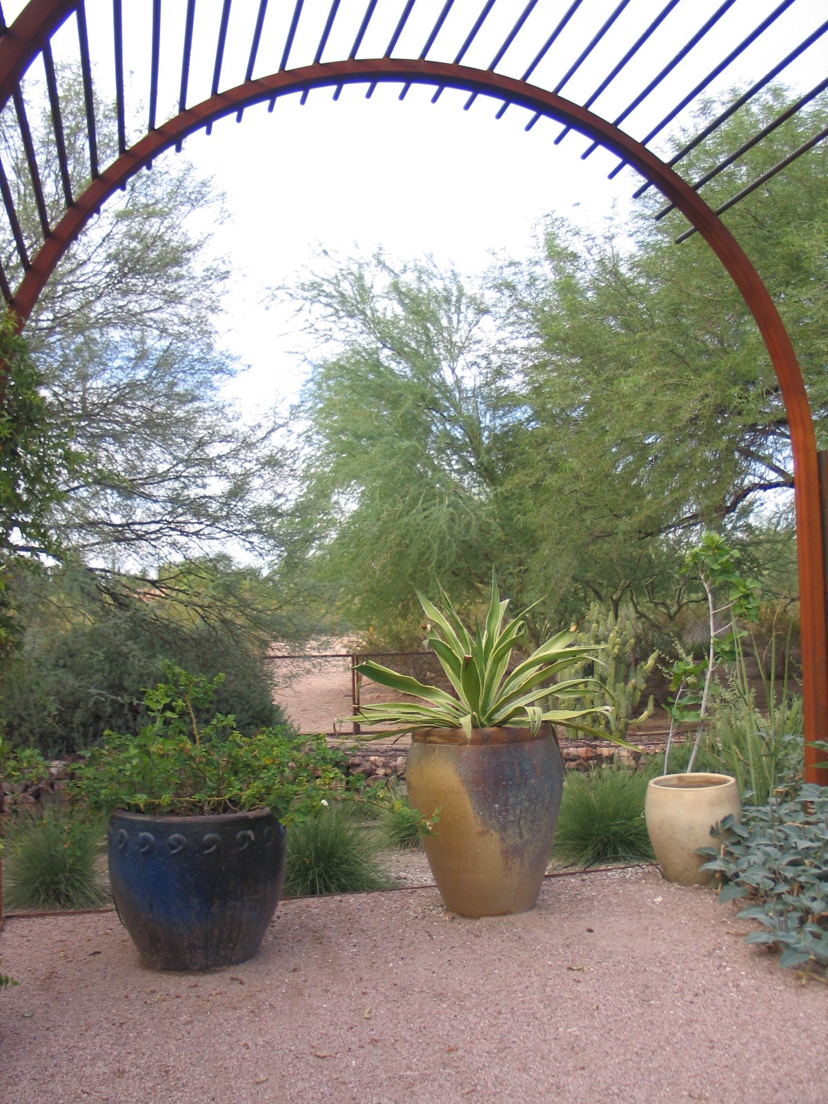
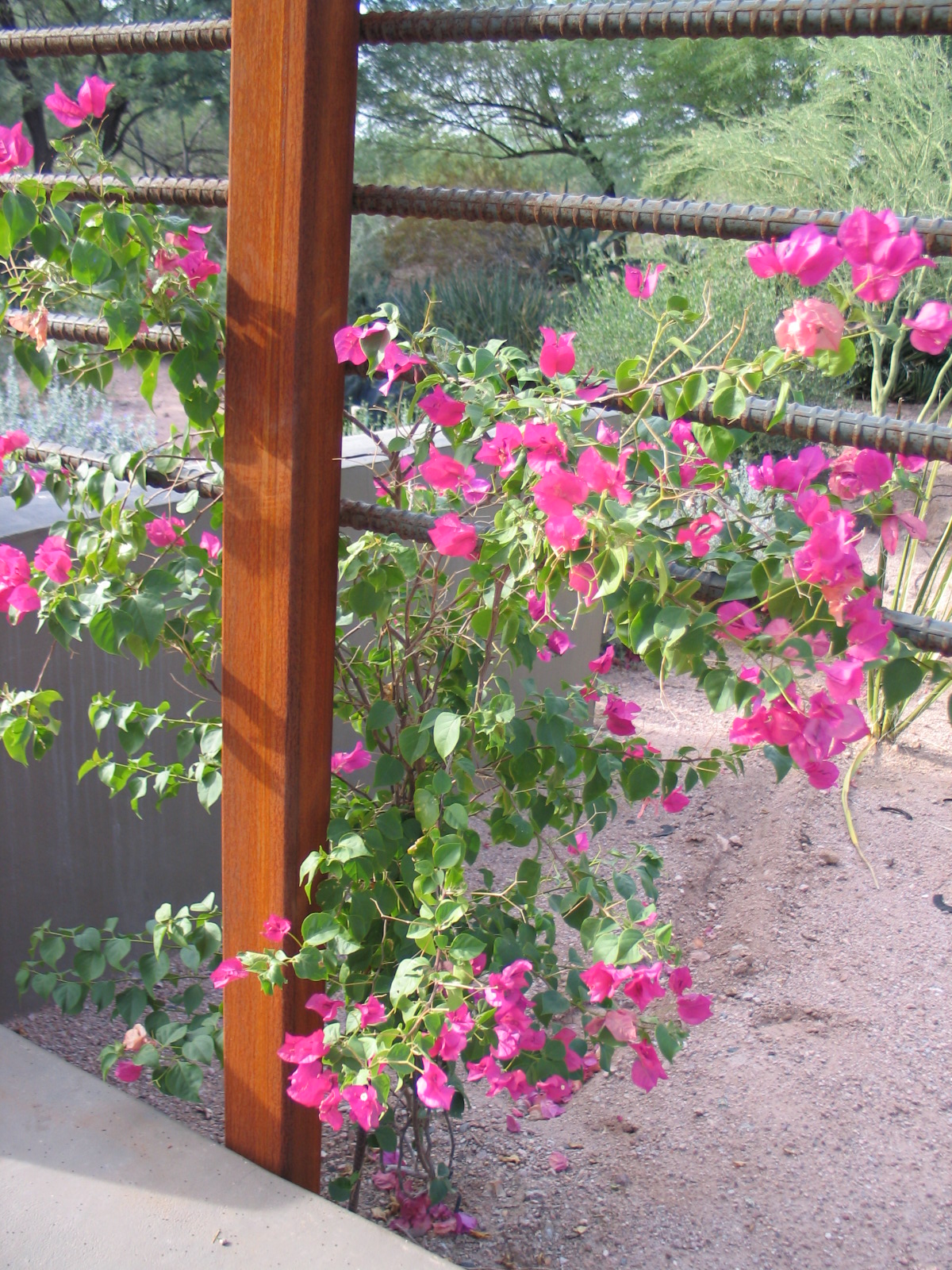
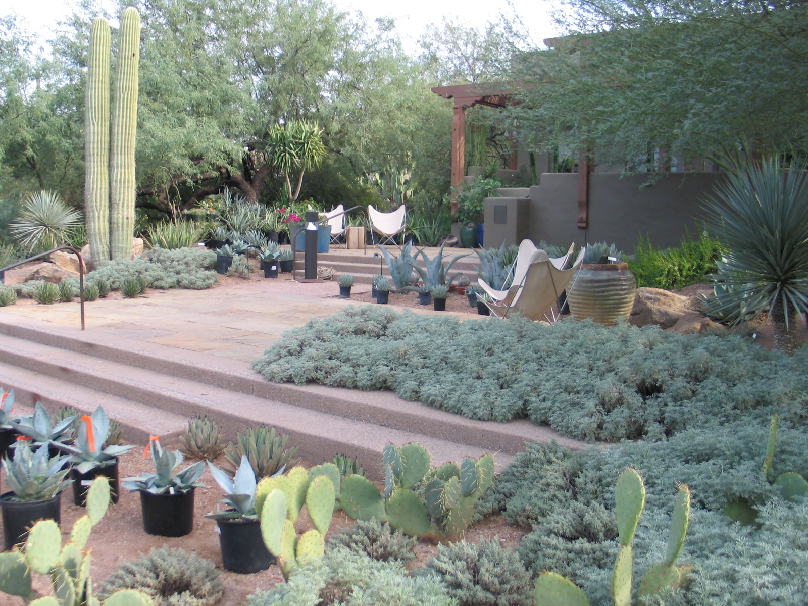
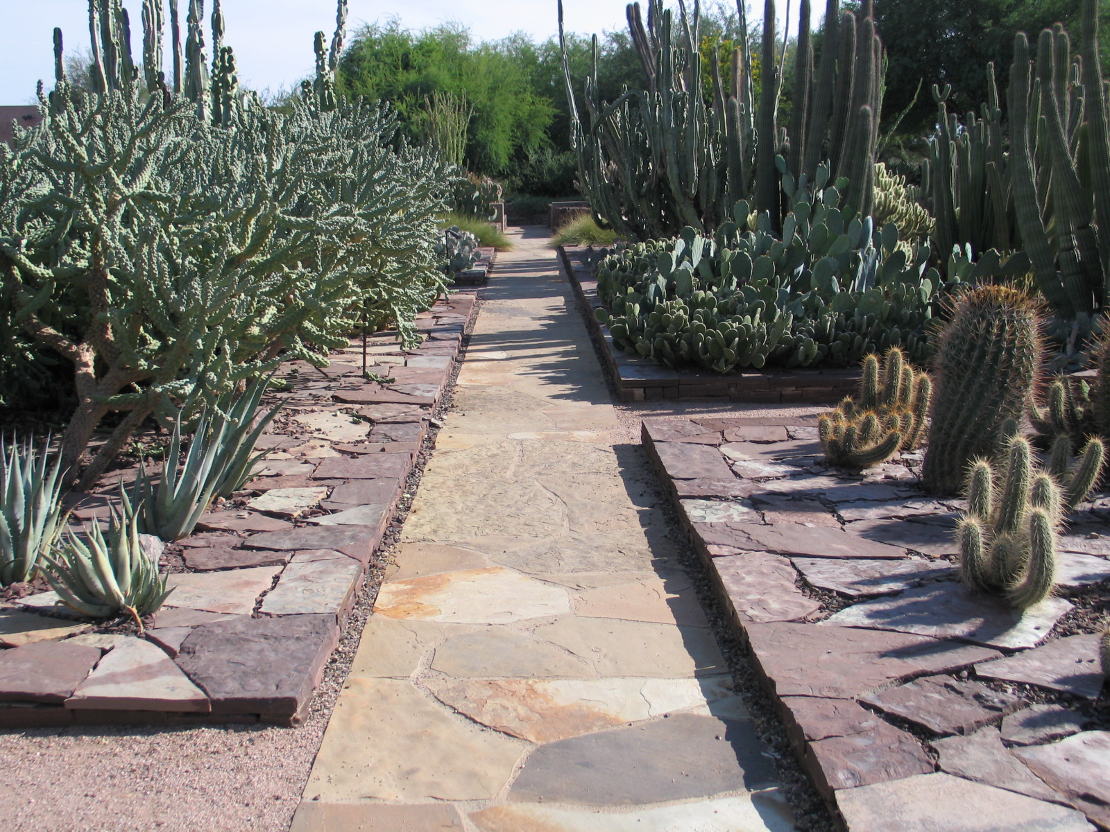
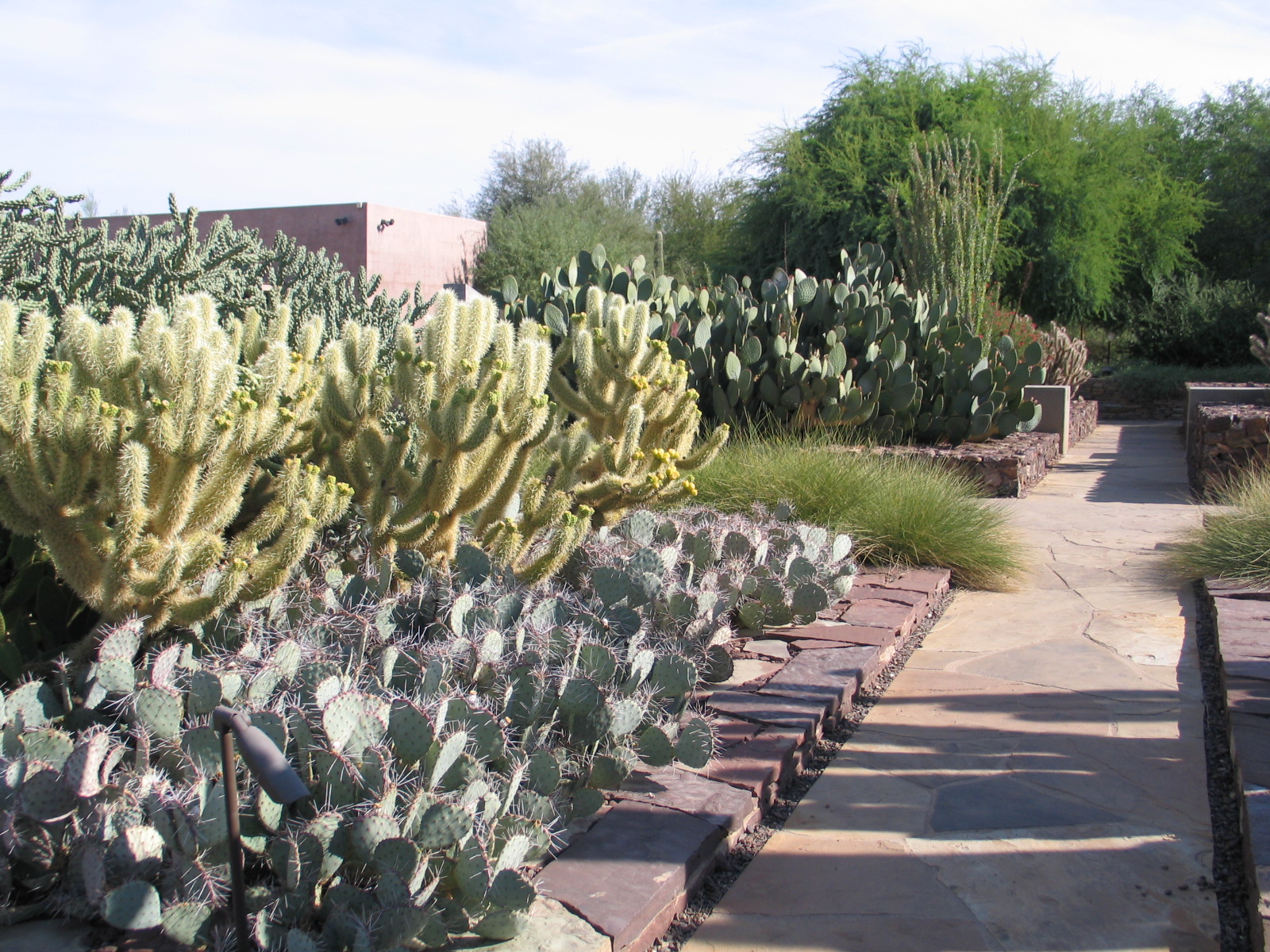
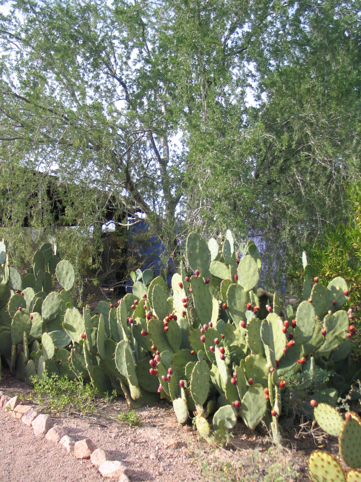
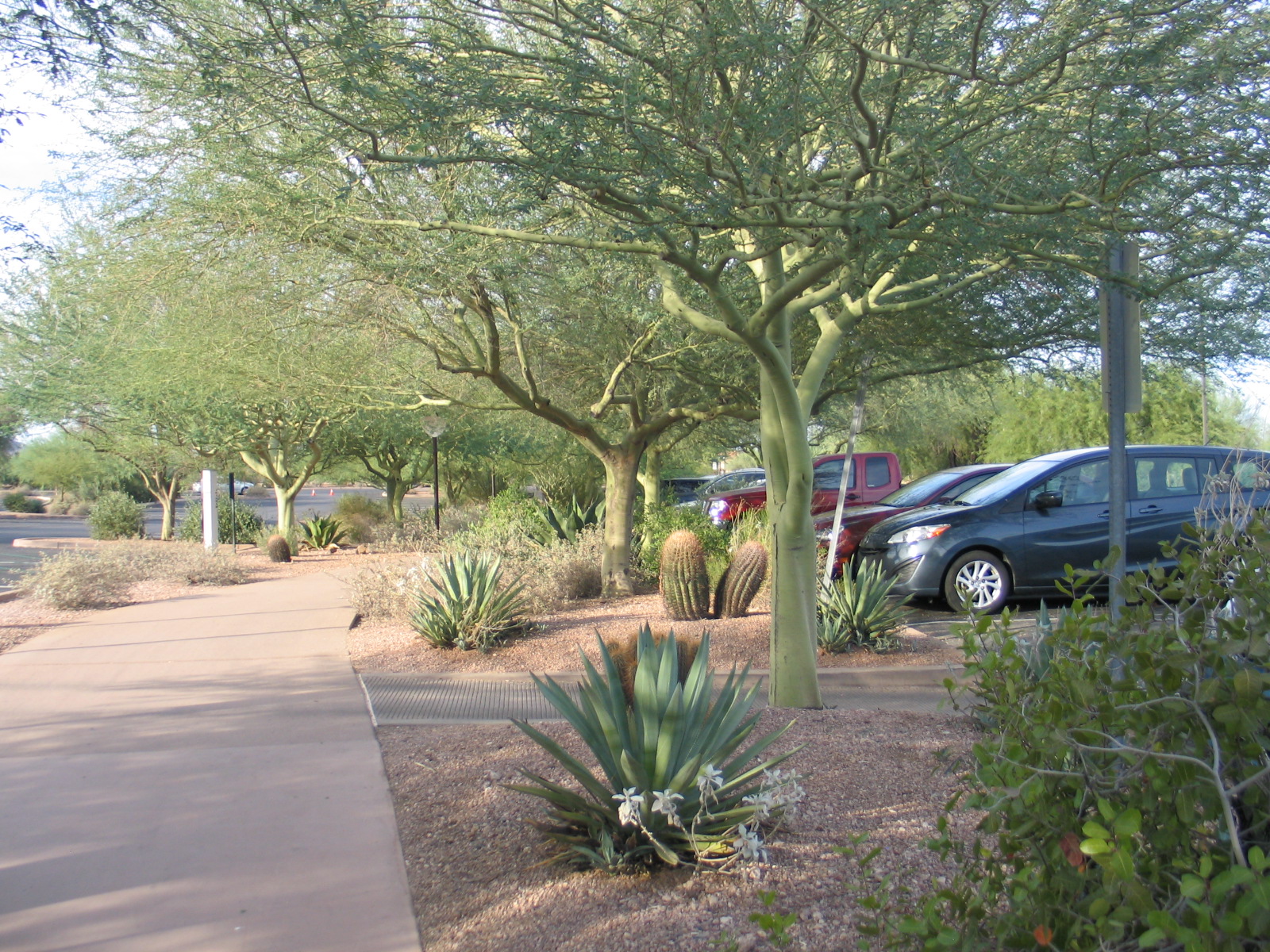
Two years ago this month I visited the Desert Botanical Garden in Phoenix, Az. Even though I was in Phoenix for the ASLA conference, I think I was more excited about visiting this garden than anything else. This year, they're celebraing their 75th anniversary - SEVENTY FIVE YEARS!The Desert Botanical Garden, despite being in the desert, has beauty, drama, softness, and life. There's a word that I hate (it starts with a "x" and ends in "scaping") that makes most people imagine a particular layout and use of plant materials that just makes my head hurt. Things have changed, though, and design of water wise planting has evolved!The folks at the Desert Botanical Garden have done a beautiful job with the materials they use. Most of the arbors, gates, trellises, and things like that are made with raw steel and rebar. They've oxidized into being gorgeous rusted pieces that are both crisp in their design and rustic in their finish. Next up is the use of concrete - oh yes, concrete is wonderful stuff! This board-formed concrete wall with the wood bench attached to it is so nicely detailed! There's this lovely seat wall with a green stone inlay that becomes a very discrete water feature at the other end. The water aspect of this would be easy to overlook, it is not showy or loud. Water, of course, is important for many reasons, but a big gurgling fountain would be out of place here. Tempting, but not appropriate.I only recall one other water feature, also a nice quiet, appropriate piece.Nearby were some very cool butterfly chairs with white slipcovers - they even looked refreshing - which caused me to realize that even if you don't sit or touch the water, the visual cue of taking a break is still a powerful (refreshing) force.Above you can get a real feel for the place - materials retain their integrity; for example, stone is used like stone, and it isn't just veneer. The colors belong here, and boldness is introduced sparingly. Here, the planting not only steals the show, it IS the show thanks to strategic restraint in all the other materials. Take a peek at the next several images - notice how the materials are used honestly, With color and a sense of place in mind, here are more of my favorites: Last, but not least I leave you with the parking lot (that's right, the parking lot) and a bunny with two quail (the quail blend, just behind the bunny to the right, in front of the succulents).Botanical gardens and arboreta are a big influence in my life and someday I hope to work on another one. In fact, I really should buy a lottery ticket because if I ever won, I'd buy some land and .... oh, do I have ideas!
Marketing (or not) With My Clients' Homes
I think I did it right. I started designing gardens before I knew that was what I would "grow up" to do. My first forays into site design as a kid included a fantasy plant nursery, pet store, and flower shop. My parents' back yard was the subject of many site plans as well, though they didn't implement my thoughts.I earned my BLA (Bachelors of Landscape Architecture, a 5 year degree), got my first "real" job, and after a few years, began taking my own projects on the side. This year I started teaching and finally went full-time as my own boss. I have essentially spent all my free time for the last mumble-mumble years absorbed in design, gardens, plants, and everything related.You would think that I would have no shortage of beautiful built projects to share online, adding new ones all the time. Below is part of why I don't put a full body of work in public online places:Naturally, many of the projects I've worked on have been with former employers. Many of them are my work or at least partly so, but the former employer owns the intellectual property. I can put the work I did in my own portfolio, that is industry standard, but it is not kosher to put that stuff on my own website or blog to promote myself apart from promoting the company I worked for at the time. In addition to that, I have agreements with some former employers that state I won't put anything online that came from my employment with them, and some clients and I have similar agreements. Not marketing with clients' projects can be limiting in this age where everything is available at a click, but there ya go.I respect the wishes of my clients and some of them are more particular about their privacy than others. I never post or put online anything that a client would like to keep private. For some of them, that is everything. The work I do is often someone's home, and I totally get wanting to keep home private!Additionally, a garden is never done. The design work is only a portion of making a quality outdoor environment. A great many projects are phased in for budget reasons or other limitations (this can take years!), and it also takes time for the plants to grow in. In a recent post on a project in Italy, you can see that the photos I posted span about 2 years - after two years, that garden is just getting to the point where it looks good enough to take photos and post them. If I had posted it too early, it would not have had the same ability to represent what the intention was in the first place.I am incredibly fortunate to work on amazing projects with amazing people - whether their own home, a rental, or a commercial or institutional project, there's opportunity for discovery, beauty, and environmental benefits all around.... so am I still doing it right? I sure hope so.
A Garden in Italy
2014 June
While I was away neglecting my modern web-presence-building duties, I enjoyed working on a particularly wonderful little project.... a Bed and Breakfast in Italy! I have never been to Italy, but when my good friend and talented architect Glenda Flaim showed me her work on Casa Incantata, I asked if I could take a stab at the planting design which had yet to be finalized. Neither of us had any idea what would happen. Come on, what do I know about plants in Italy?! Niente. The way we worked around that, and got the garden done was a genuinely collaborative effort involving Glenda, the Owners, their gardener, some dutch visitors, and me:First, Glenda sent me a photo of the site with notes (in green) on her thoughts for the planting:We chatted about the decisions on the photo - why the hedge, what is the lawn for, stuff like that. I studied snapshots of the building and tried to imagine what it would be like to be there in person. Glenda mentioned that the house had just won a national award for sustainable architecture, and was photographed soon after I started noodling with the design of the garden on paper. You can see pre-garden professional architectural photos here and here. She sent me a computer drafted file of the site and I gathered photos of plants that came to mind.I started the planting design in June 2012:I mapped out the planting design in areas with palettes. The areas got names: there was "lawn", "spicy", "meadow", and "hedge". I wrote a description of how each of these areas would be different from each other, what forms and colors I was trying to emphasize, and what colors I wanted to avoid entirely. I wrote out how these plants would change with the seasons and the desired effects. With lists of plants and their written intentions, the memos were translated into Italian and back into English through Glenda.The Owners and their gardener started looking for the plants and sent word back what was available and not, and we figured out plants that might work instead. More memos handling spacing and layout were translated back and forth, plant research was done on both continents. Plants were purchased and installed as they were found; this took a few seasons to finish. Some were purchased in Italy, some shipped from the U.S., and the last, elusive bulb was a gift from some visitors from Holland who learned of the missing bulb in discussions of the garden during their stay.Over the last 2 years, I've gotten a couple of photos a season so I could see how the garden was doing. They had wasted no time getting plants in the ground. Later that same year (fall 2012), the lawn (Hernaria glabra) which also extended between the pavers, was getting its start:By the following Spring (2013) it had filled-in very nicely!The other plants were coming along too:By that Summer, you could see the different zones expressing themselves:And just last month, I got another update:It is challenging to know how a garden will look when you're designing it, and there were many anxious moments when I knew they were investing in my advice and I could only hope that the Owners would like the results. I'm not sure it is possible to tell if the image in my head matches what the garden will become. I can't know ahead of time if the Owners will like what the garden will become, and yet it is dependent on them and everyone who takes care of it to continue to support the design's intention as the garden is maintained.I am finally able to share (two years later) how things are going here in this post. I can also share that the owners are very happy with their garden, and conveyed to me this sentiment:
Il giardino che ho sempre sognato!!!
(The garden I have always dreamed about!!!)
I couldn't have asked for more.
It's Been Too Long
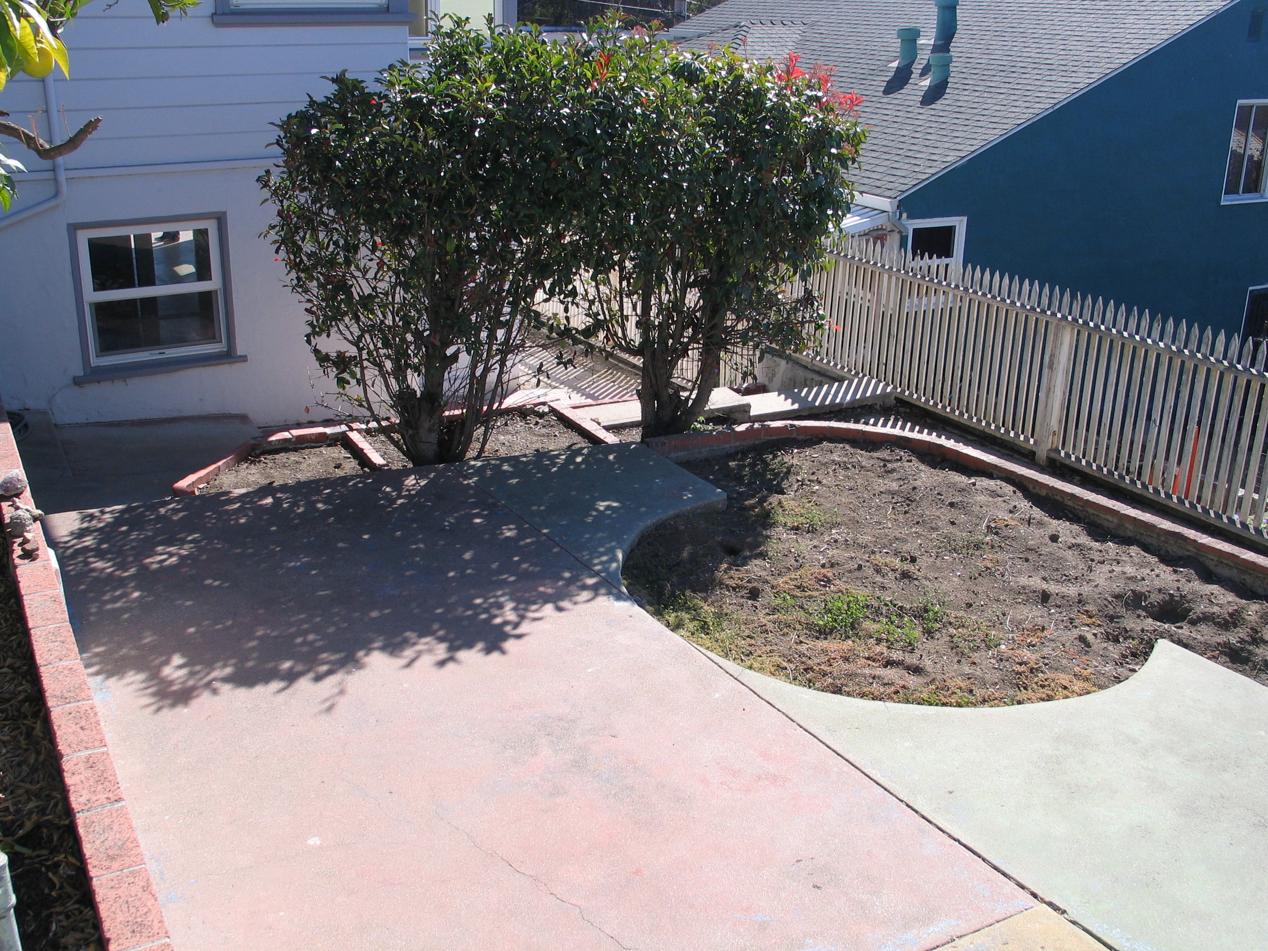
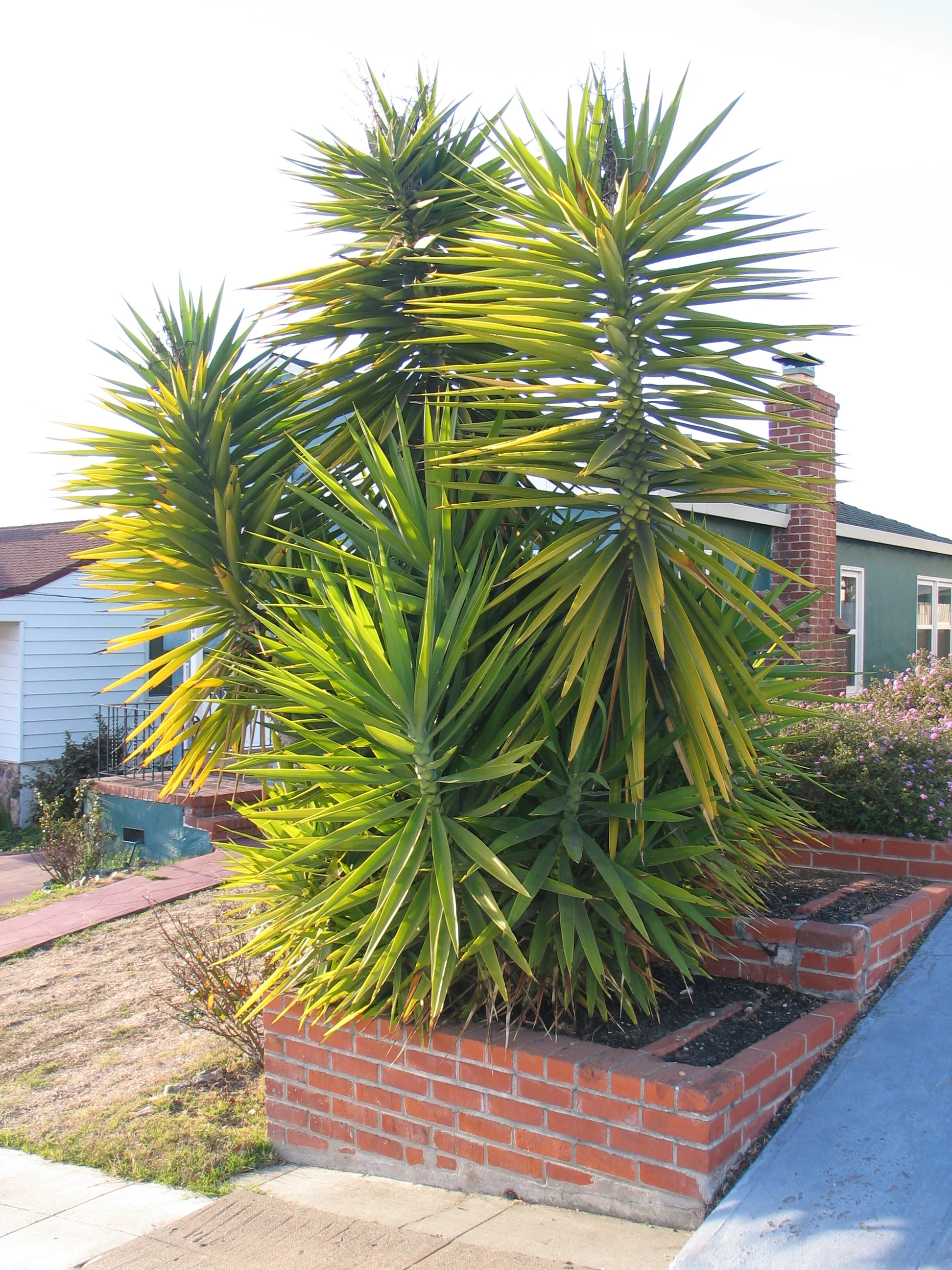
Hello there! I've been away from this blog far too long. Things have been quite busy with a whole mess of life and work changes.The big news is that I moved into a new place. I'm in the very beginning stages of designing the garden here, and wanted to share with you some of the challenges I am facing and what I'm doing to make this place as useful and responsive to my needs as possible. This could take me a while, but I'm game if you are:For starters, the previous occupants planted thorny Bougainvillea next to the gate to one of the side yards. You have to squeeze by it and hope there aren't any bad guys lurking behind it to get into the rear yard. Don't catch your sleeve on the sickly, not even fragrant, and incredibly thorny patio tree rose on the left as you go:If you look behind the Bougainvillea, you'll see a very typical fence which blocks visibility into the back yard (hello again, bad guys!). A friend commented to me that it seemed wrong to block views into what will hopefully become a beautiful side yard. I have to agree! Visibility issues aside, what you can't see is that this opaque fence is nailed to the once charming original fence:Way cuter, right?! yep, I thought so too. and next is that side yard that will eventually become beautiful. Here, what you can't see are all the weed seeds that germinated the moment I moved in keeping me busy indefinitely: If you follow the side yard, you come to the back where there's some lovely painted concrete in reggae colors with teensy tiny meaningless lawns and very old, well established Photinia (one of my least favorite shrubs EVER!). How snazzy is that bit of solid fencing there? I love how it gracefully blocks the view of the neighbor's solid wall. Equally enjoyable is the brick cap on the concrete retaining walls. No lack of design consideration here:Which brings me to the shed. I love love love the shed. It has holes in the roof and sides from what appear to be buckshot so that rain drips directly on the shelf and is rotting the framing. I have no idea what that railing is for, nor why there's a flagpole footing in front of the little railing surrounded platform. I call it the pulpit. The pulpit's days are numbered; same goes for the flagpole footing and little concrete pad in front of it.In the front is an unreasonable amount of purple Lantana and this thing, probably Yucca elephantipes. It will get way too big for that little retaining wall and will break it and start all kinds of trouble in the next couple of years if I don't remove it. Sorry, Yucca, you gotta go.The good thing is that when I go to the shed and look out past the festive reggae concrete, Photinias, and strange tiny lawns, I can enjoy sunsets every night.Here's to resolving the design issues and playing in the yard!
Pinterest and Design Communication
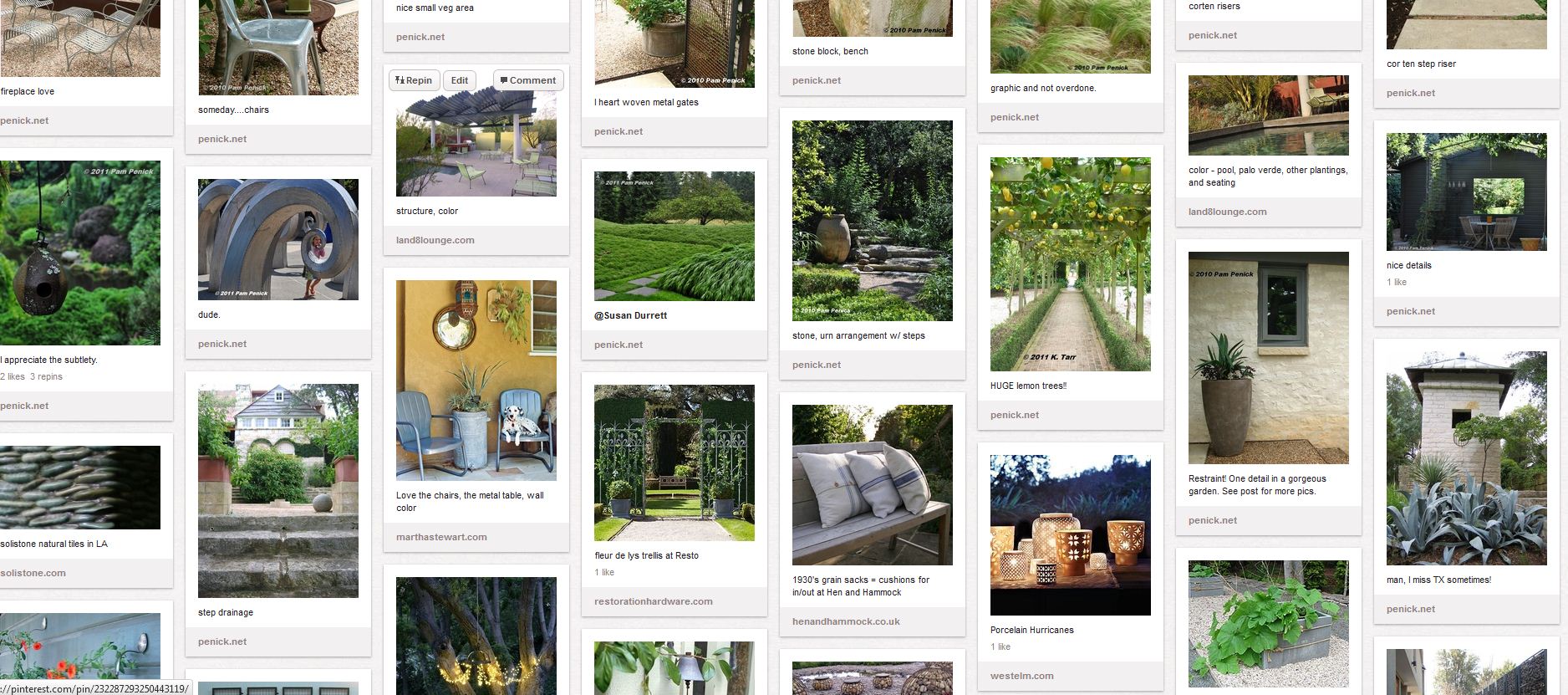 It never occurred to me until recently to use Pinterest.com as a communication tool in collaboration with a client. Granted, Pinterest can’t actually do the design work for me or my client, but it does allow for us to collaborate and understand each other in a common forum....which is proving to be so fun!Pinterest isn’t everyone's favorite tool, but for those who want to collect images and links in a web-based place, it is a lot of fun. Back in the day (like a year ago), I saved links as internet explorer's bookmarks and images were always saved to my hard-drive (which means I don't know where they came from). Now, I have links for non image-heavy things (like articles) on Delicious.com and images (with links!) are on Pinterest. I can access all this stuff as a resource from anywhere there's internet access. That's kinda handy! (What Pinterest is)I’ve only just tried using it with a client recently, and at one of our meetings, I asked what they thought. So far, so good – my client likes being able to share a photo with me, and we add comments back and forth for each other. It is so gratifying to see that my client has started a board for their project, and have “re-pinned” some “pins” from my various boards (with comments!) which helps me zero-in on exactly what they’re responding to.People can "pin" images from anywhere on the internet, and they can also upload images from their own computer... but don't mistake someone's pins for their own design ability or experience. The images come from all over the place, with and without express permission. There is some concern over permissions and Pinterest's user agreement. Several months ago, I did have the experience of re-pinning an image and then getting an email from Pinterest that the owner of that image had requested it be taken down, so they emailed me a link to the source and removed the image from every instance on Pinterest.So- if you're planning a project, or looking for an easier way to share images with your client or designer than saving and e-mailing both a link and the picture, this may be a useful thing for you!If you want to follow my boards, go ahead. I take no credit for the work you see there, though, unless expressly noted as my own.
Inspiration Insanity
A good friend recently sent me a link to Pinterest.com. I had to wonder if I really needed yet another online account, another place to find or keep inspirational images and links. I'm already swimming in images and ideas, oodles of mental jumping-off points......I mean, really:- Digital images on my computer (tens of thousands of images)- Binders stuffed full of clipped images from magazines (an entire bookshelf)- Flat file with posters, more clippings, and materials (full, I could use another)- Filing cabinets with articles (four cabinets....at least some of it is bills)- Online: Flickr, iGoogle, Delicious ... (let's not even go there)- Bulletin boards with stuff tacked on (not to mention the fridge)- boxes of paint color fans, fabrics, stone samples....- and never mind the magazines and books....But, after spending a couple of hours (admittedly about four) on the site this morning and saving a few dozen photos, I gave-in and e-mailed them for an invitation to join. Its not like I don't appreciate more (and more and more) inspiration.....but escaping the computer long enough to eat breakfast would be good, too.
"Low Maintenance" - an utterly useless buzzword
I have come to loathe the term "low maintenance". It is essentially meaningless. I am starting to wonder if when a client requests a "low maintenance" design, what they're really saying is that they don't want to do any work themselves, including taking the trouble to find a decent gardener or asking questions.It is imperative for both the client and the designer to discuss exactly what types of gardening activities may occur before doing any design work. Be honest! REALLY! For example, when I got my hair cut last week, I told the stylist that I wash and comb my hair, nothing more. I would not promise to use any appliances or products, and she gave me a cut that works well for my specific needs.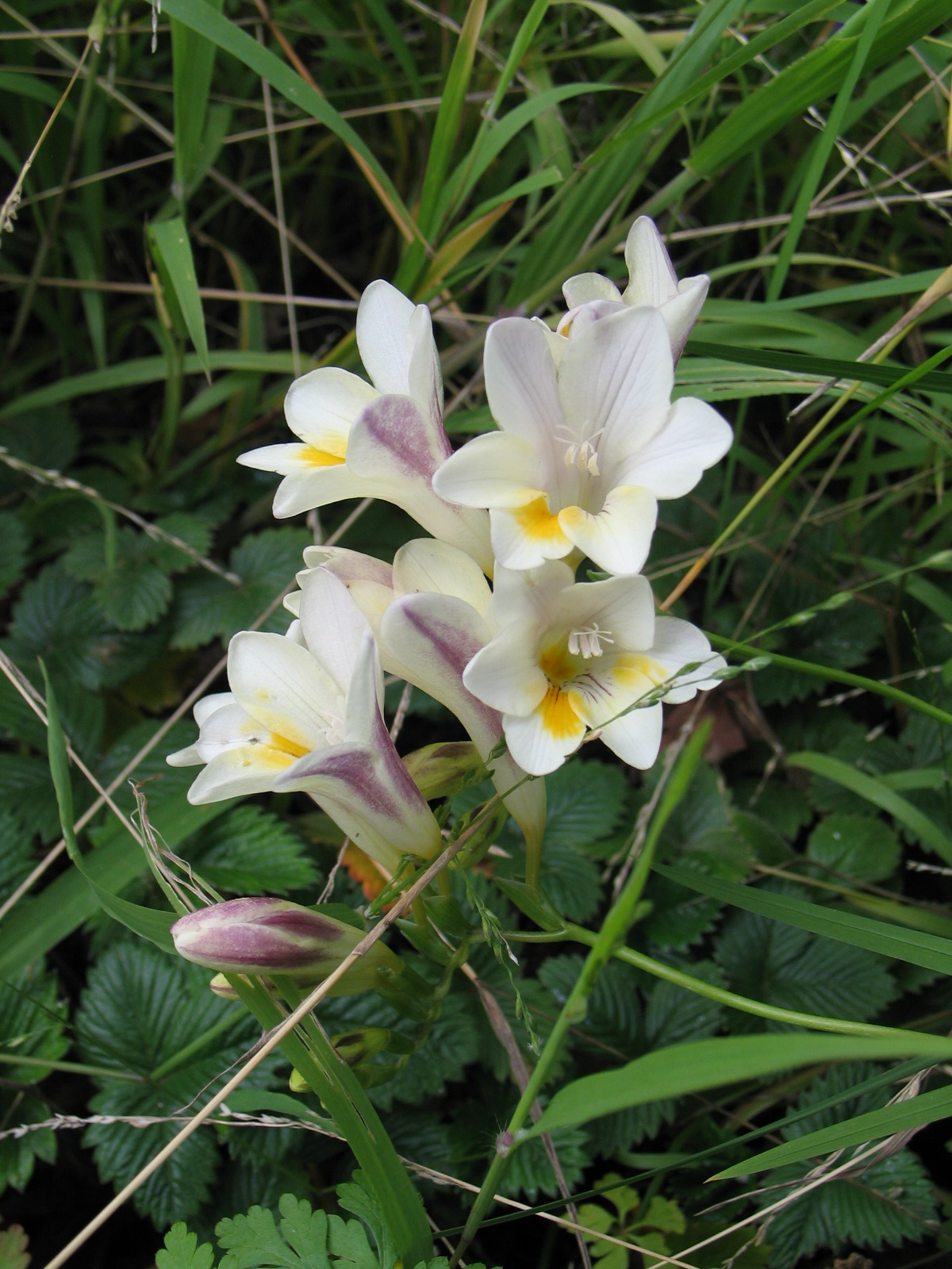 You can see from the above photo (taken on my patio earlier this month) that thanks to my personal distaste for weeding, I have a number of (un-planned) plants just growing together, willy-nilly, doing their thing. I am okay with that, so this is the design solution that my personal garden employs. I'll let nearly anything grow as long as it is healthy and doesn't produce anything painful (thorns, burrs, stingers). This works for me because I live in an apartment and I know that if/when I move, the whole thing will be ripped up - there's not much to be gained by fretting over weeds. Given a different situation, my personal garden might look quite different or it might not.I also grow several roses and a few shrubs - some in containers, some not. I grow dozens of rare bulbs, more than dozens of perennials, and a few orchids, but I don't do much "work". Every year I reliably cut Roses, Freesias, and Sweet Peas for indoor bouquets. I know that rose flowers develop at the very end of a branch and that each cut to remove a flower is, in fact, a pruning cut (and where to take that cut). I also know that my Sweet Peas will bloom nearly forever as long as I keep cutting the flowers off - it is just terrible having an apartment full of sweet pea flowers, just awful...
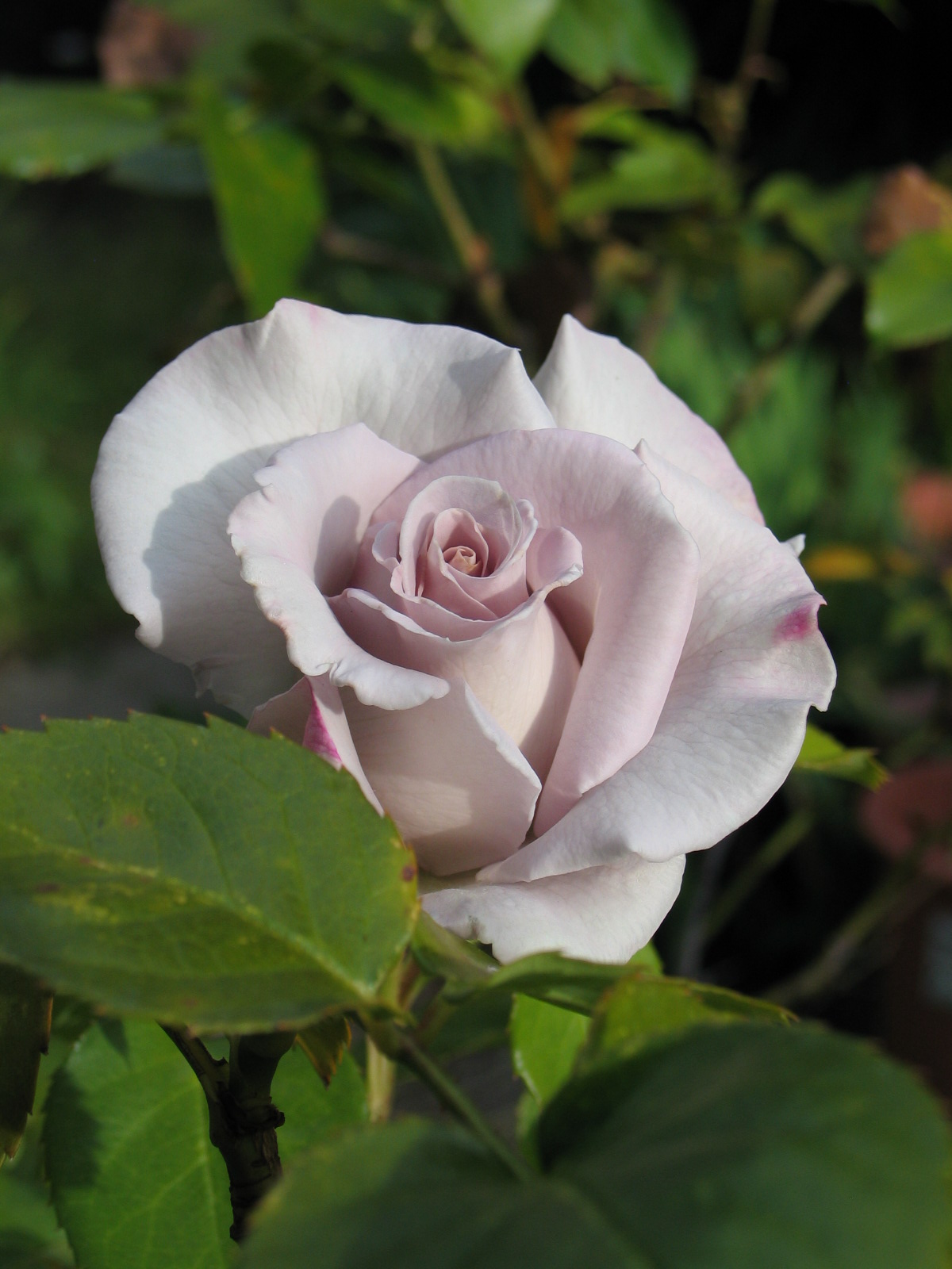 There are countless ways to design a garden so that it doesn't feel like a ton of unwanted work, and so that taking care of it is at least somewhat enjoyable. Getting it to that point is as good a reason as any to work with a design professional and/or do a bit of research for your own garden design solutions....but please don't call cutting flowers "maintenance", that just takes out all the fun.
Associations
I read Studio G's blog often, it is a wonderful source of entertainment for me. I recently stumbled across this post, clicking on it because of the title "Religion & Garden Design". Read it.Reading that gave me the nudge I needed to finally mention associations here, they are powerful and invisible aspects of design work that must never be ignored. The better designers understand that they must get to know their clients so that subtle, personal conflicts of negative associations can be avoided and positive associations used for inspiration. Consider the meaning in shapes, colors, plants, orientation (East/West), and views.For example: when I see Beautyberry (the plant image in Studio G's post) I remember the Dallas Arboretum, visiting my friend Melinda, and working at a wonderful Dallas Landscape Architecture firm with wonderful people.The smell of Tomatoes reminds me of my childhood in Southern California, as does for Australian Tree Fern, Mother Fern, Amaryllis belladonna, Agapanthus, and Tuberous Begonias (especially the orange ones).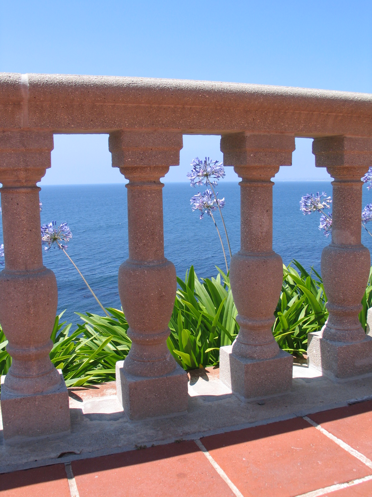 Red and yellow together remind me of Mc Donalds, which I don't think very highly of....I've seen Topher Delaney speak about her landscape work a couple of times, I also met her once at a lunch. At the beginning of a project, she asks her clients to tell her about where they lived when they were little. They have a conversation and get to know each other. She uses this more personal understanding in her design work and succeeds in bringing more meaning to the work than most.So - who are you designing for? ....and how will the design meet their needs, bring meaning, or make it beautiful for the eye of the beholder?
Container Garden Inspiration
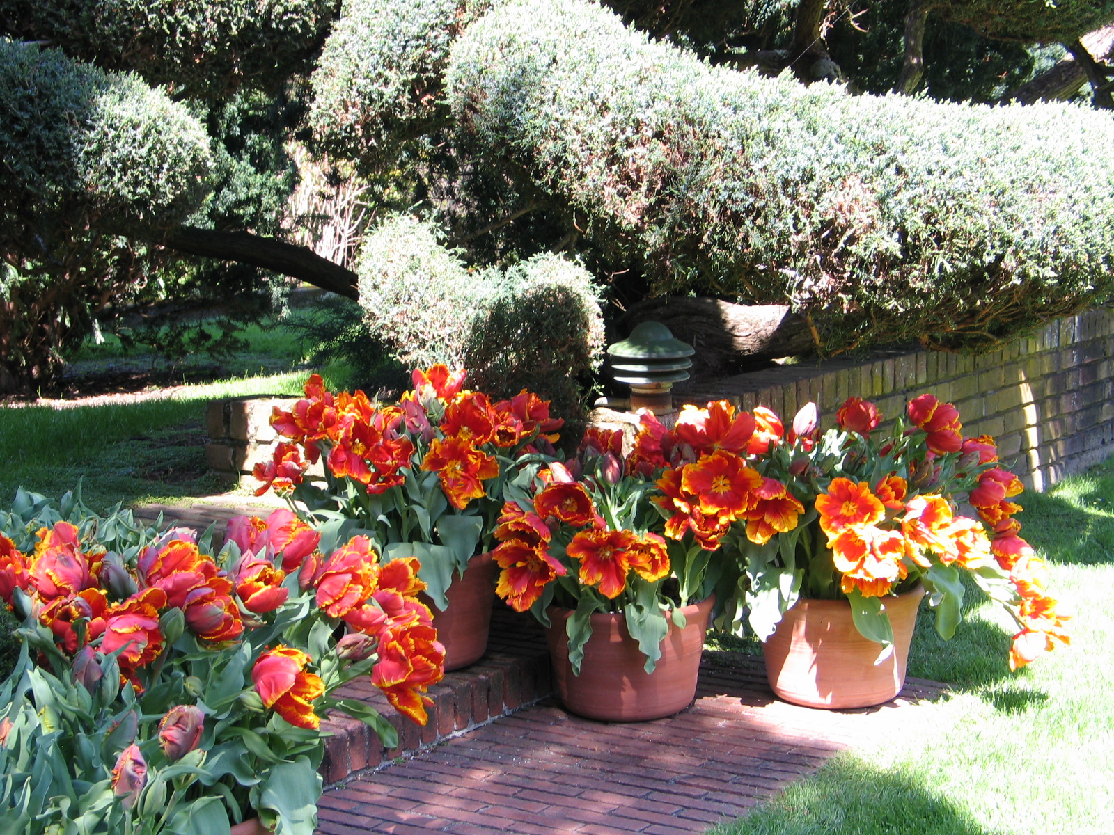 I love container gardening! Love it. I garden both in the ground and in containers at home, I can't keep from filling pretty much everything with soil and something growing.
I wanted to post this because not every pot looks good with every plant, some look truly wonderful together, and some just awful. I design for clients very differently than I treat my own container garden. I choose containers for clients that go with the architecture, the plants, and so forth.
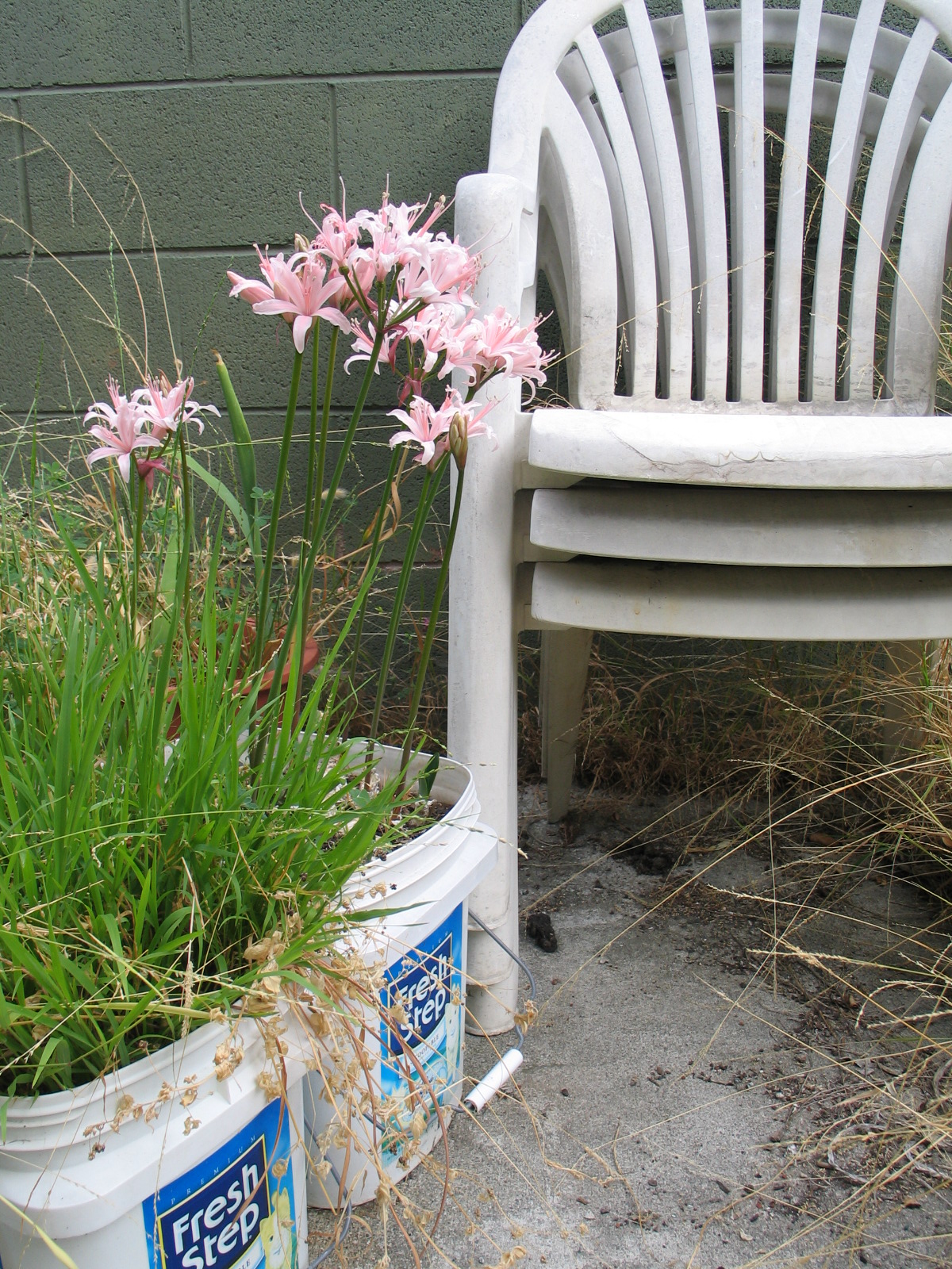
In my own garden, however, the containers can be almost anything - kitty litter buckets with holes drilled in the bottom, nursery liners, and a random assortment of impulse purchases and gifts. 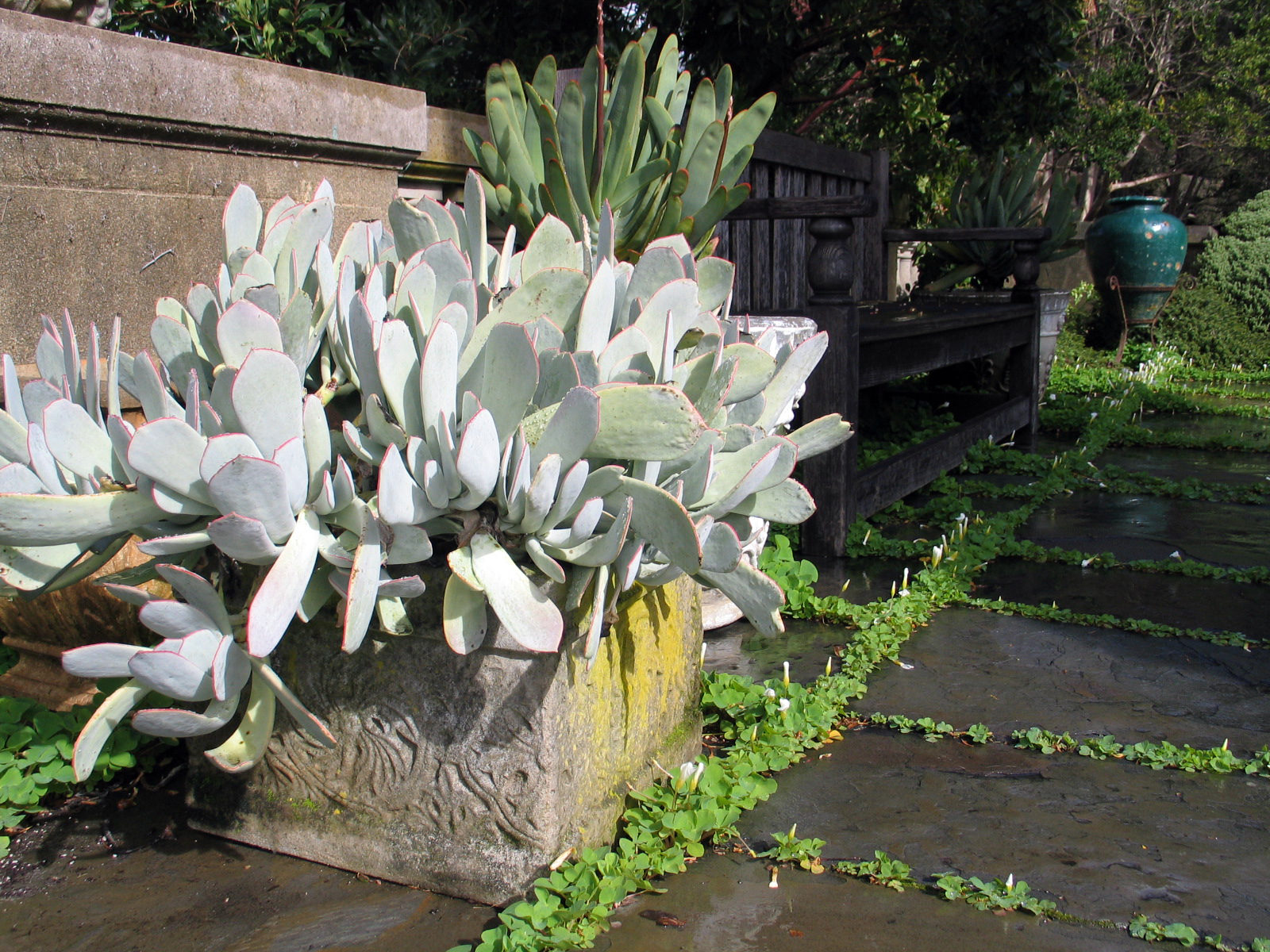
I think that the most important thing when putting together a container garden is deciding what you are showcasing; the plant or the pot?
Which plant looks good in a particular pot can be surprising. I have found that it is important to see them together if the purchase is an important one. If you're like me, and buy plants and pots on impulse, don't sweat it. But, if the container and the plant will be important focal pieces of your design, then it is worth it to take either the pot (or a small sample with the same finish) or the plants that will be used (at least a bouquet of the leaves and a good imagination) around with you when shopping.
My Client's Plants
I am working on the design of a garden in San Francisco and was pleasantly surprised today by the delivery of the Hellebores that were ordered from Canada. While I was potting them for protection during their wait to be installed at the site, it occurred to me that this shipment of plants represented some thoughts on customer service and the design/construction processes.Most Landscape Architecture firms would not be able to accept delivery of plants for a client and care for those plants until they could be installed. They might rely instead on either using only the plants that are seasonally available or contract growing (with someone else) to care for those plants that must be received before the site is ready. There are issues of liability (what if they die?!), space, and materials for the task. What results can be either a prohibitively complicated and expensive ordeal, a garden that is skewed to one particular season, or having to ask the client to be patient and wait while plants become available in the future (not always acceptable by some clients). 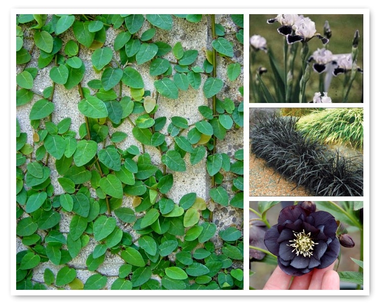 Included in this particular project there will be a discrete courtyard featuring a statue. We are using four different plants; Ficus pumila (Creeping Fig), Ophiopogon nigrescens (Black Mondograss), Helleborous 'Onyx Odyssea' (a double black flowering Lenten Rose), and Iris 'Frosted Velvet' (a "miniature tall" form Bearded Iris). The Ficus and Ophiopogon are evergreen and will form the main planting to show off the sculpture, then the Iris will be in bloom in the Spring with leaves from late Winter through Summer, and the Hellebores will be in bloom in Winter with leaves holding on through Spring. I don't expect to have both Irises and Hellebores flower at the same time, though it is possible that this could occur depending on weather conditions and temperatures (especially in the Bay Area). While the Irises prefer more sun and the Hellebores more shade, the site location and orientation make it possible to use both in the same small area.I presented the palette (above) to the client earlier this month. Before doing presenting, I learned that the Iris were not going to be shipped until next July, and that our local growers who carried the Hellebores had already sold out for the year. I explained to the client that we would be ordering the Iris for delivery nine months in the future and that the Hellebores would need to be ordered immediately from Canada before the grower's shipping season closed. He accepted the planting concept, so I had the plants ordered with delivery to my home. I did this for a couple of reasons:1. I wanted to inspect the plants before anyone else saw them to make sure there were no problems (and I work from home). Having them shipped to my home also meant that I could accept delivery at any time (they arrived today - the Saturday after Thanksgiving) regardless of holidays, weekends, and business hours.2. The plants would be shipped bare root and would need immediate attention by someone who knew what to do and had the time.3. The landscape contractor had not yet been formally retained.4. This also made me feel that I was giving my client the best service I could by personally protecting his investment in them and, by extension, his trust in me.It is my habit to order plants from all over the world. Because of this, I knew ahead of time that both mail order companies were reputable and that the plants would likely be in great shape. I was not disappointed! Fraser's Thimble Farms worked with me to hold the plants until the payment arrived. I took their advice to pay for air priority shipping. The plants also required a Phytosanitary Certificate (they were inspected by the Canadian Food Inspection Agency) before coming into the U.S. The shipment was also opened and inspected by U.S. Customs upon arrival.Below are some photos from this morning's potting:
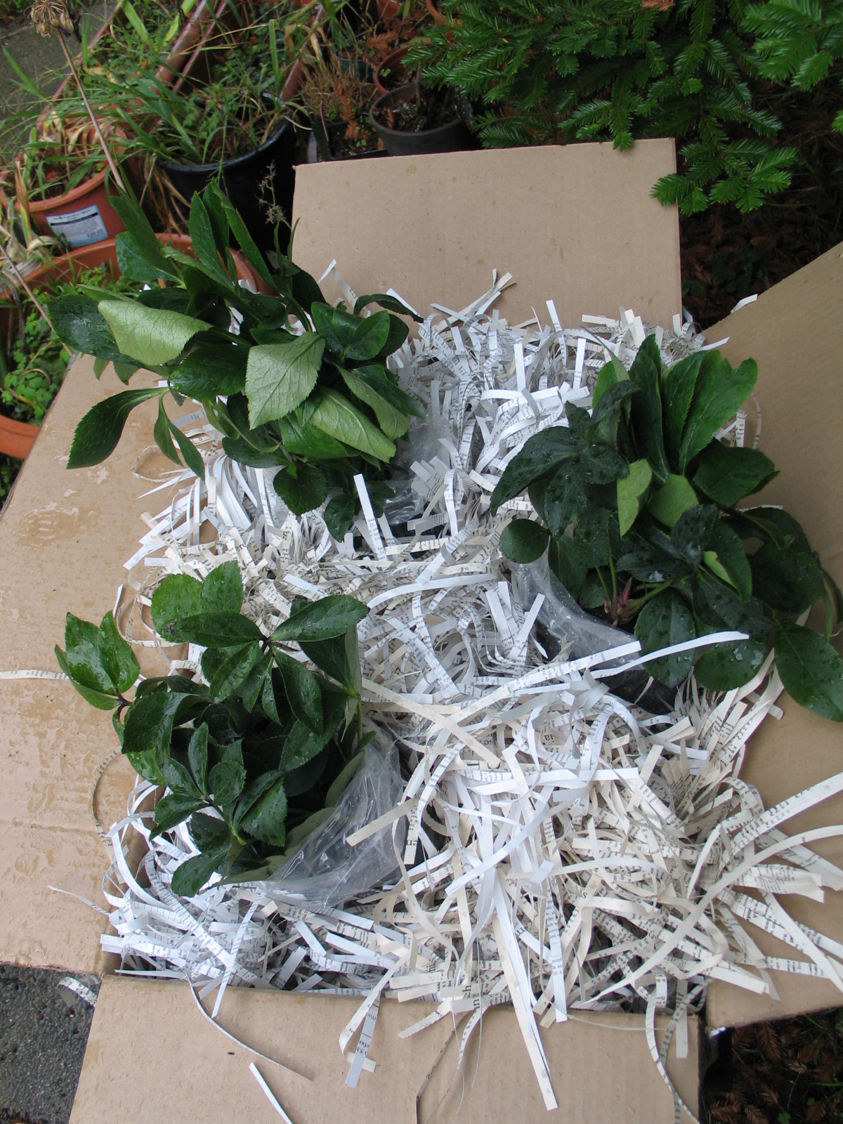
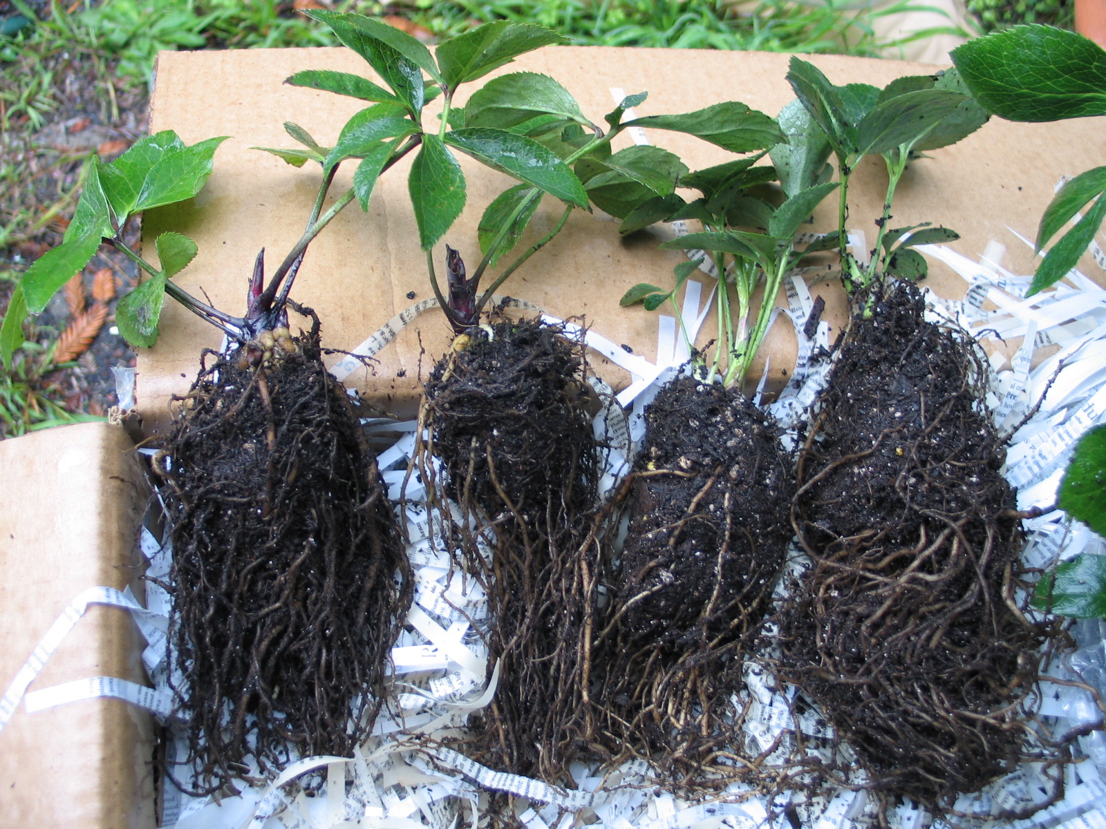
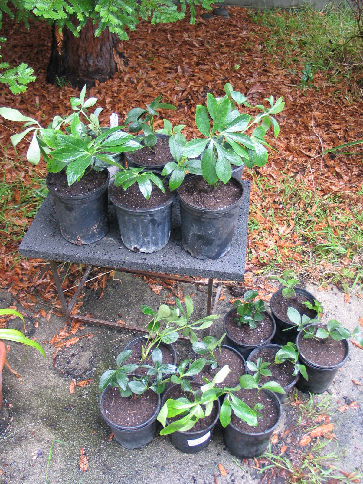 All in all, excellent plants - potted and ready for what comes next. My own Hellebores have not leafed-out yet, so it will be interesting to see how these behave, but they each have new growth on them (see the middle photo). They've been through a lot, being bare-rooted, inspected twice, then finally re-potted (they'll be disturbed again soon when they're planted in their new home).I have been frustrated in the past with the issues that come up when trying to design a garden around the seasonal availability of the plants I want to use. I think it is well worth the extra effort to get the exact plants desired rather than giving up and just finding something else that is less of a pain. I am looking forward to seeing them planted in their new home and will post again....
"Low Maintenance" Gardens?
It seems that everyone is aware that gardens can require some effort to maintain. Professionals in the landscape design and construction industry understand that the success of any outdoor space depends on thoughtful design, quality installation, and ongoing, intelligent maintenance. Not one of these three items can deliver the desired result without the other two.
Read moreI am honored. Thanks!
My friend and colleague Page Huyette asked me to write a post for her blog as a guest writer. I wrote about editing as part of the design process. Everyone works differently, I think this post illuminates part of my process really well (it should, I wrote it!).Here is the link to that post, and below one of the images (because no blog post should be without pictures!). I took this snapshot one day a few years ago. I had been working for a while and when I "came up for air", I thought that all the stuff on my desk (at Scott Lewis Landscape Architecture) looked interesting together. I'm glad I took the picture, I had no idea it would come in handy some day.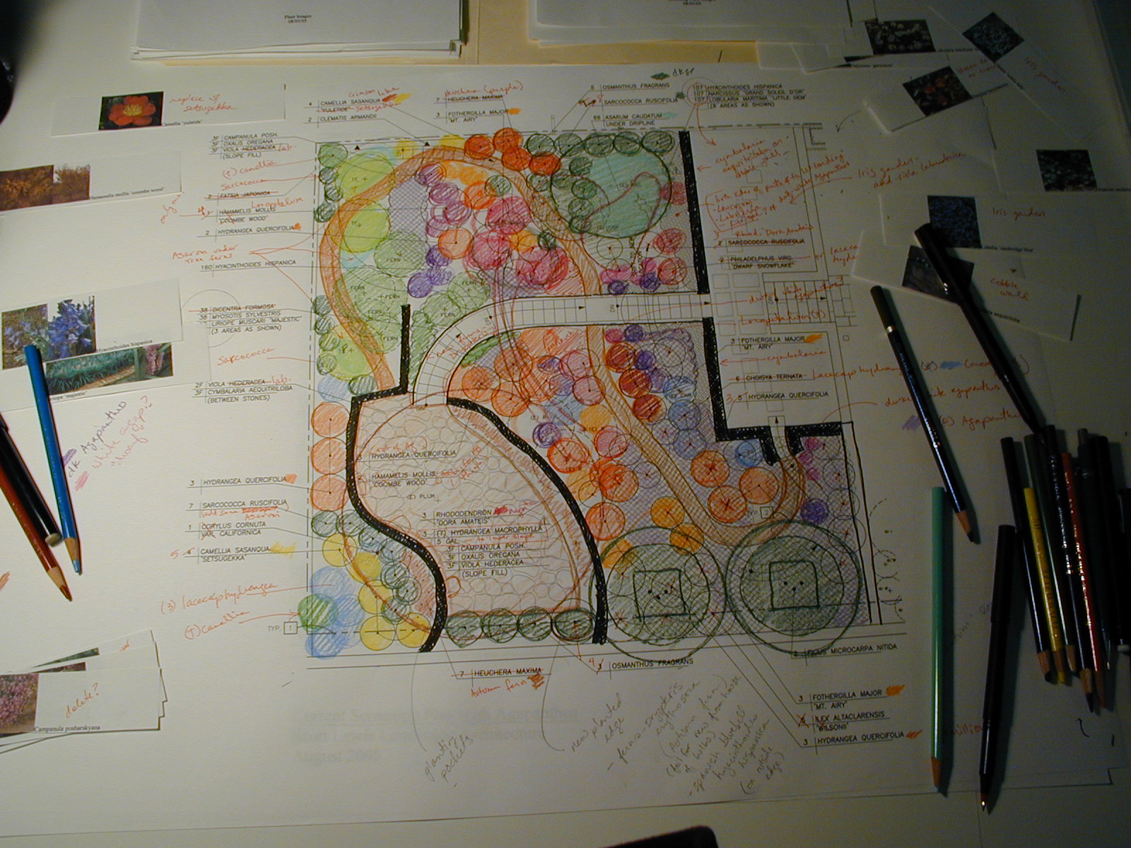 Thanks!
Filoli Before Spring
Notice how even in lousy light and with the deciduous woody plants being void of leaves, this garden is photogenic? That it's simple (especially at this time of year, before the flower riot is in full swing) the plantings are stunning, and how the structure of this garden - the layers and mass of its "bones" - support the flower beds. When looking at the images, did you feel like it was not colorful enough? I didn't.
Read moreOW, mommy, HOT!
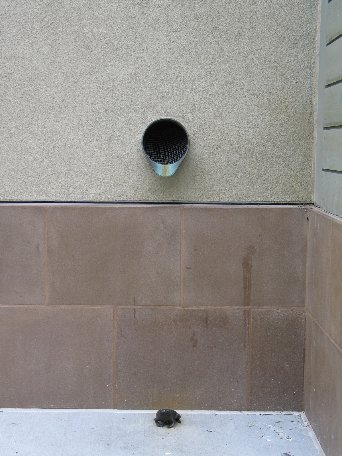
scupper frog sculpture
A little girl walked up to this deer (one of two in the shopping center, both are kid magnets) and reached out to pet the deer. She said, "OW, mommy, HOT!" Aesthetics aside, as a designer, I will forevermore think twice before putting a metal kid-magnet in any position where it could get hot and potentially hurt someone.
Read moreGarden of Contrasts
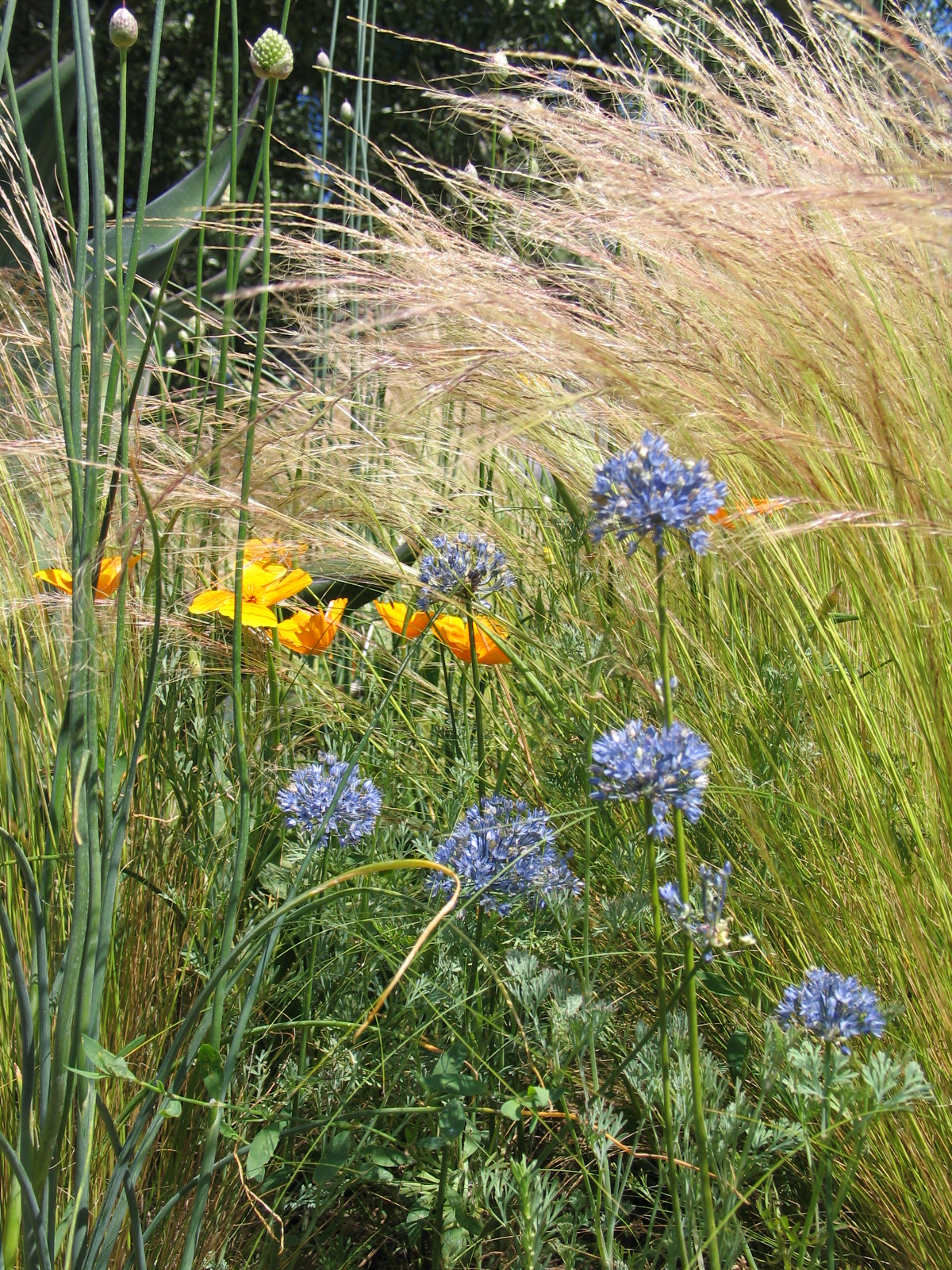
garden of contrasts
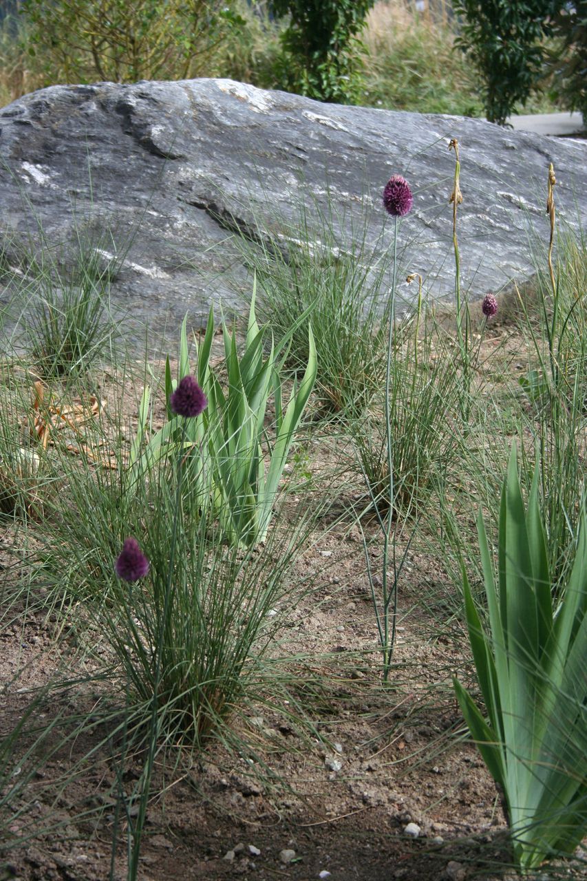
However, when I was last at Cornerstone, I saw the Garden of Contrasts by Oehme and van Sweden for the first time. WELL! Spikey, beautiful green Agaves sit solidly among ever-swishing Stipa tenuissima and the flower heads of Allium caeruleum and the occasional California Poppy. The scene doesn't stop moving, revealing those little teensy hits of pure blue (the Allium flowers) and orange.
Read moreWasting money 101
Aqiulegia vulgaris 'burnished rose' LF aa
Rosa 'Iceberg'
There are more ways to waste money needlessly than there are to save. I say that based on my years of experience seeing clients do things that I could not have made up. Truth IS stranger than fiction!!If I had a nickel for every time I turned to a co-worker and said "No, really. I didn't make it up!" ....Let me tell you a story:I once spent many hours developing a planting plan for a large, historic tudor home owned by a couple who's only comment on the firm's written questionnaire was that the wife didn't like the color orange or roses. I left messages and sent several e-mails asking for a quick phone call to try to narrow down what she did like so that I had some direction from them on the design. I presented the drawings in a few meetings with the husband having never heard back from the wife. Finally, after a couple of months, she attended a design meeting. She came into the room and plunked down a stack of magazine clippings of images that she liked, plants she was drawn to, etc. She had heard all my messages, and wanted to respond, but didn't let me know that she was doing anything at all on her end. As it turned out, she had a strong preference for white flowers and chartreuse foliage. In fact, she didn't like much that wasn't chartreuse or white. Never mind that the quality of the light at their home was too harsh for white and chartreuse without something else to set it off (like a nice deep green). She also noted that she likes shrub roses, but not hybrid teas. Had this client spoken up sooner, they would have saved thousands of dollars in design fees and I would've saved a lot of time.The one thing they did right in this story was to speak up before we were under construction. It is far less costly to change directions on paper than it is in the field.

